01 / Backtracking
Users returned to previous steps during the deposit journey.
 Back to work
Context & my role
The cashier was one piece of XSITE, a new casino frontend, and the piece with the most rules attached: deposits, withdrawals, bonuses, promo codes, saved payment methods, transaction states and hand-offs to external payment authorisation.
I was accountable for it from discovery to implementation review, but I didn’t produce the final UI. I delegated the research to a UX Researcher and the design execution to a mid-level Product Designer, and kept ownership of the direction, the key decisions and the quality of the result.
The brief
The previous Cashier had been built for an earlier version of the product and no longer matched the direction of the new frontend. We needed to rethink how deposits, withdrawals, bonuses and payment methods worked within the new XSITE experience.
The challenge was to make a complex transactional journey easier to understand while supporting different payment methods, saved cards, bonuses and transaction states.
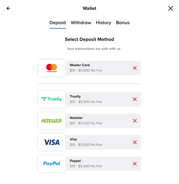
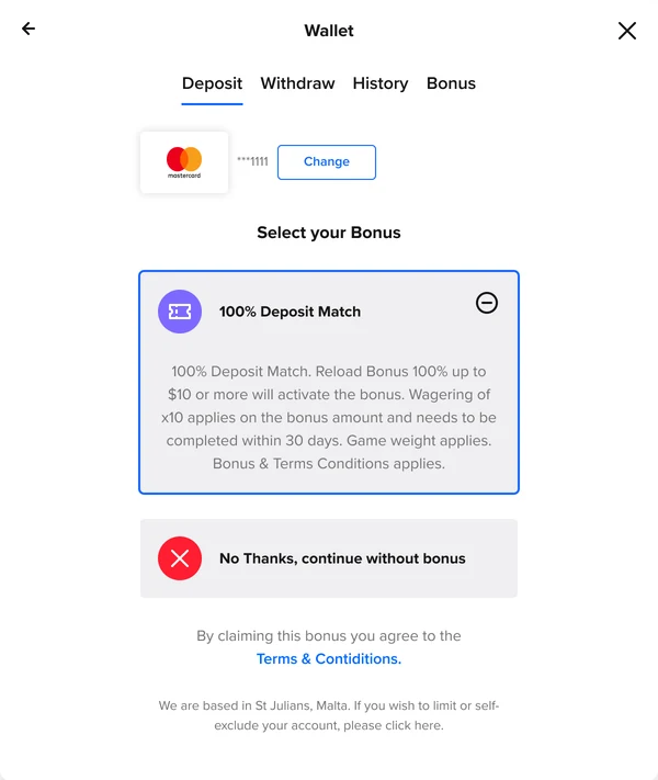
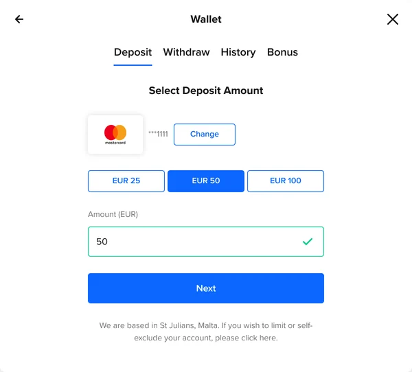
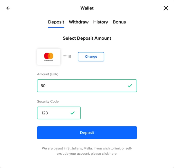
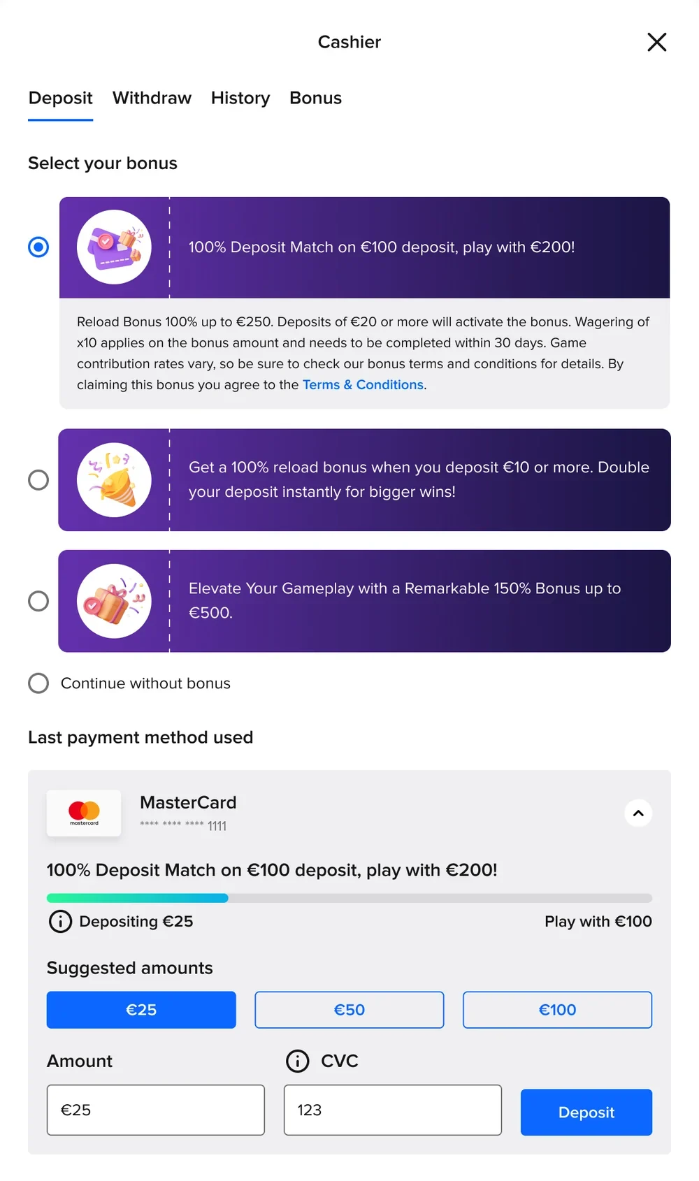
The first Cashier split the deposit into separate screens for payment method, bonus, amount and confirmation. Users had to move through each decision sequentially to complete a deposit.
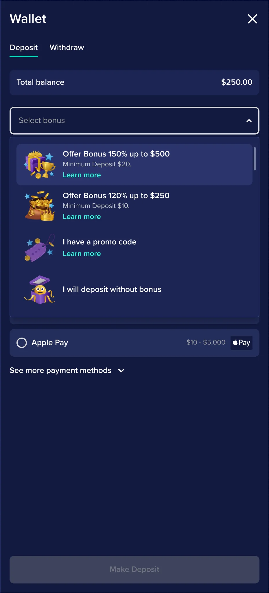
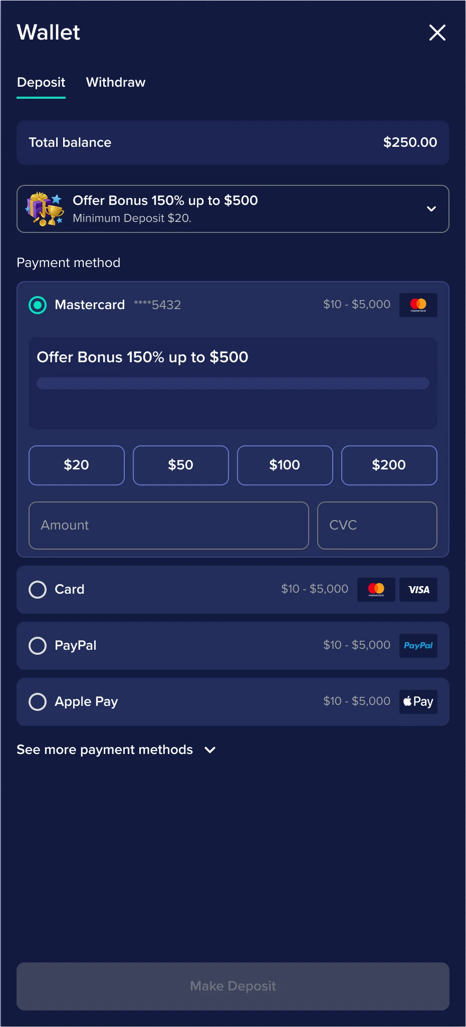
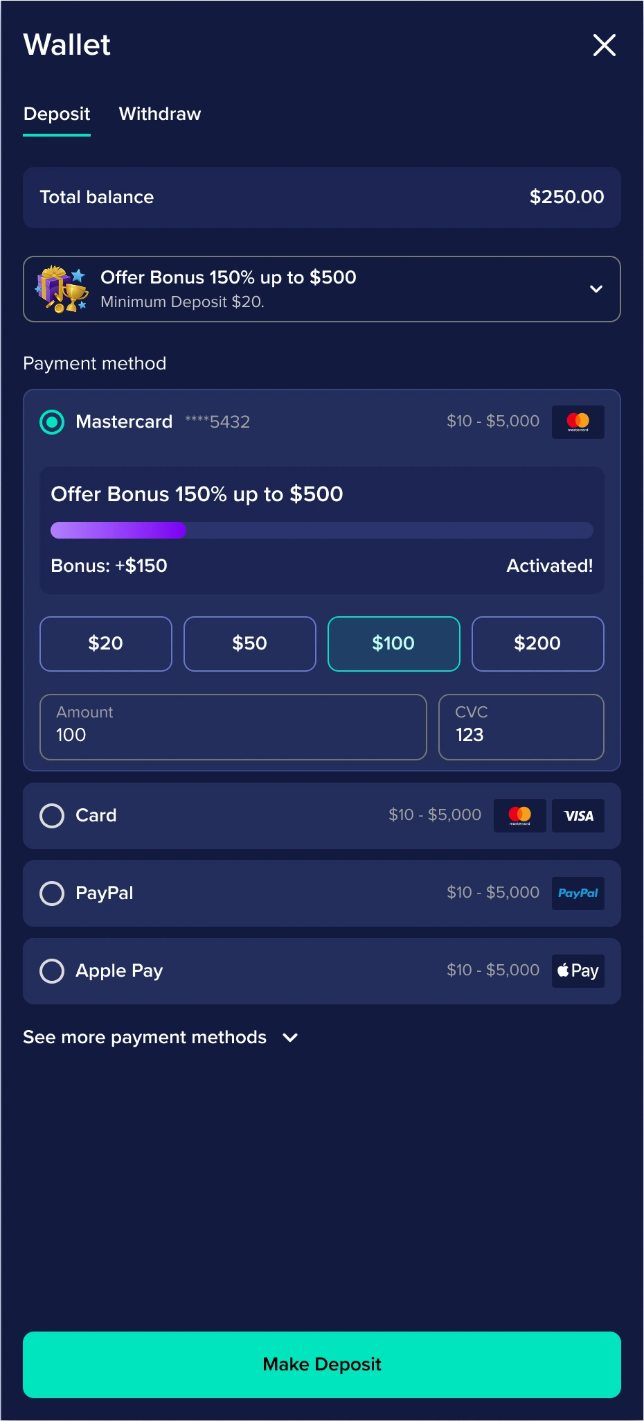
Within WAND’s architecture, I led its evolution into one flow: bonuses, payment methods, conditions and suggested amounts together, revealed progressively. Further ideas stayed out of scope because of technical constraints.
XSITE’s new frontend let us shape the cashier on our own terms, grounded in research rather than inherited limits. That is the work this case study follows.
Behavioural analysis · FullStory
We reviewed behavioural data and session replays in FullStory to identify recurring friction in the existing Cashier.
01 / Backtracking
Users returned to previous steps during the deposit journey.
02 / Low bonus interaction
Users often continued without opening the bonus selector. Its badge-like appearance made the action easy to miss.
03 / External drop-off
Drop-off increased after users moved into third-party payment flows.
These third-party experiences were largely outside our design control, so we shared the findings with Engineering to review the integrations and reduce technical friction where possible.
Discovery
28Casino products benchmarked
I set the scope of the benchmark and handed the research to a UX Researcher.
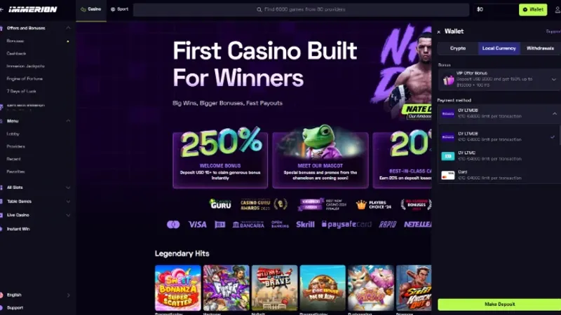
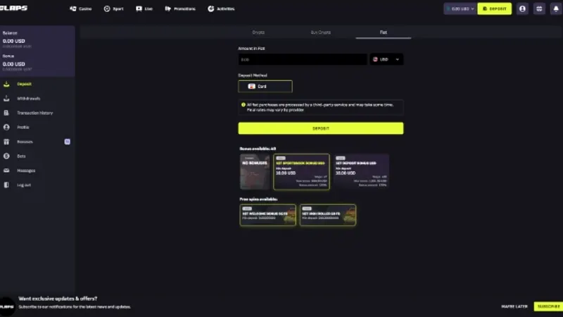
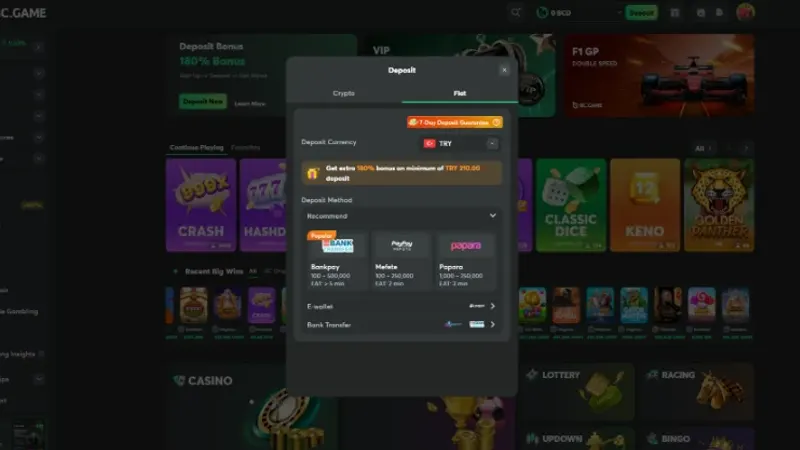
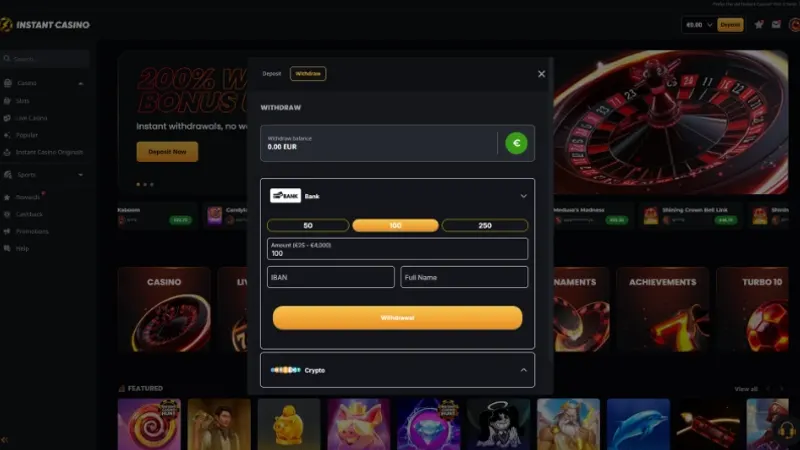
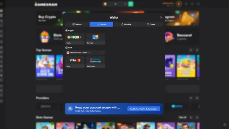
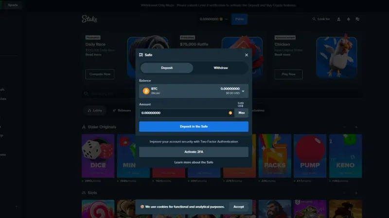
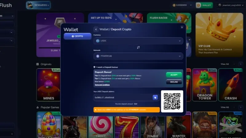
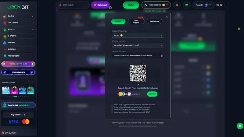
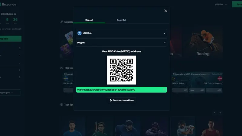
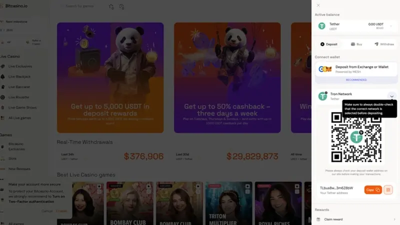
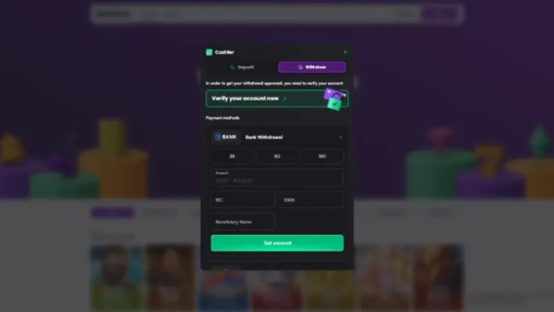
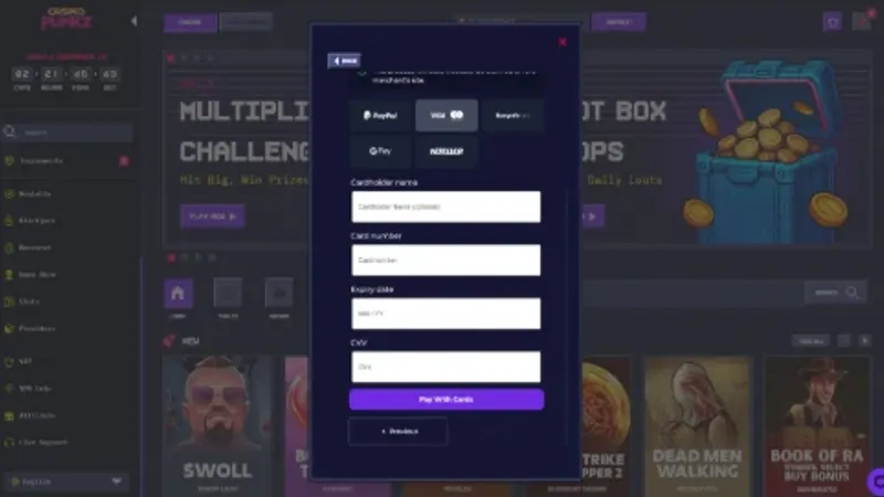
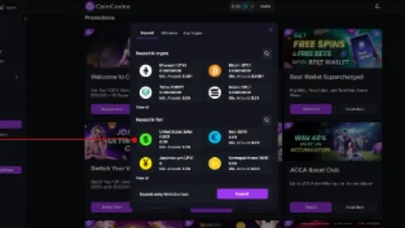
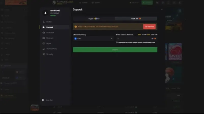
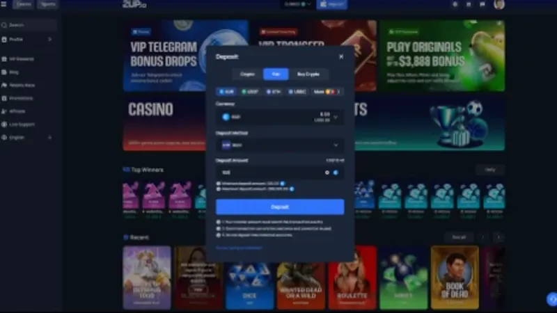
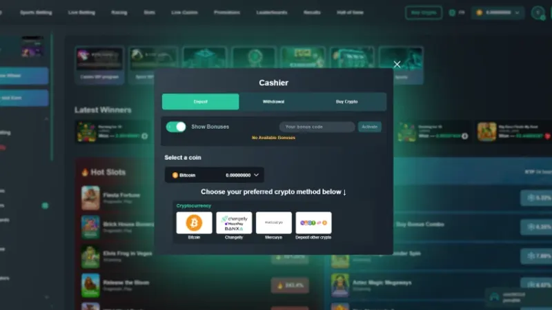
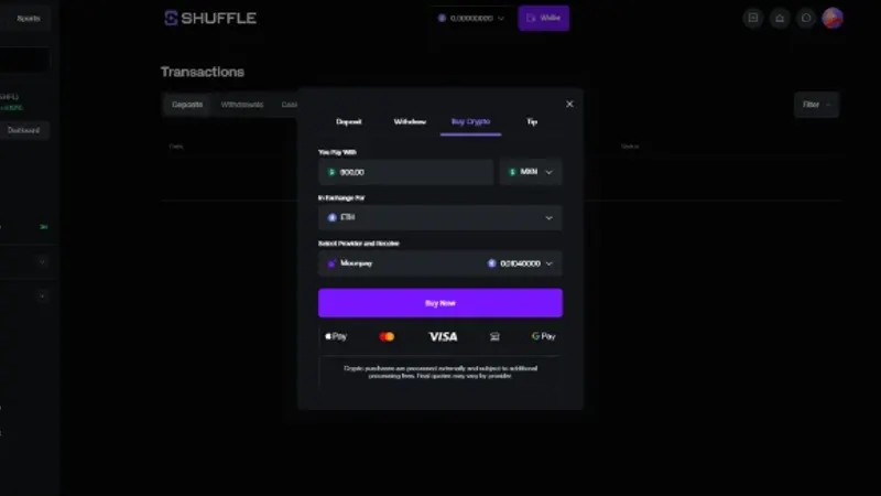
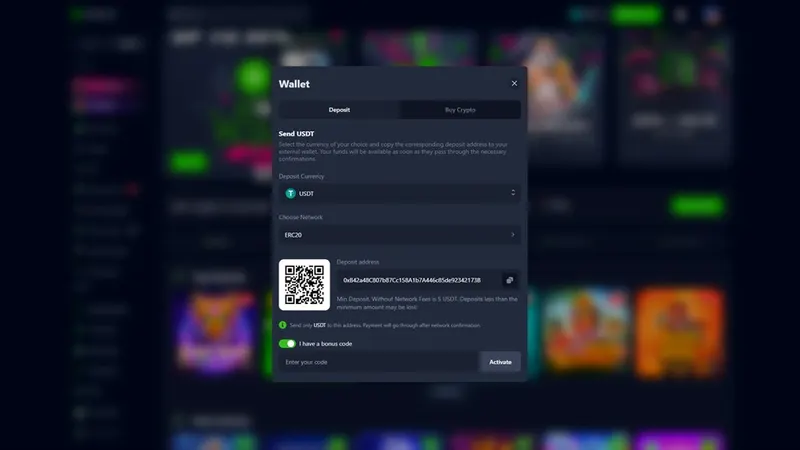
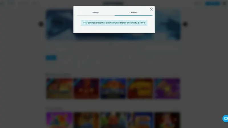
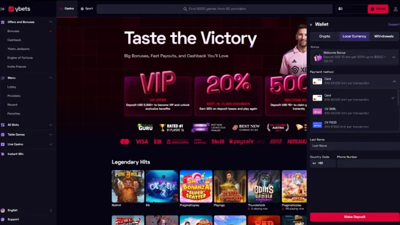
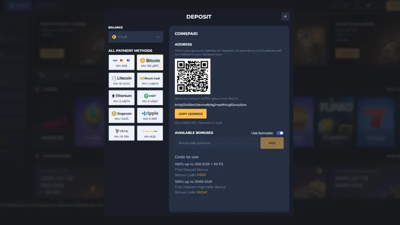
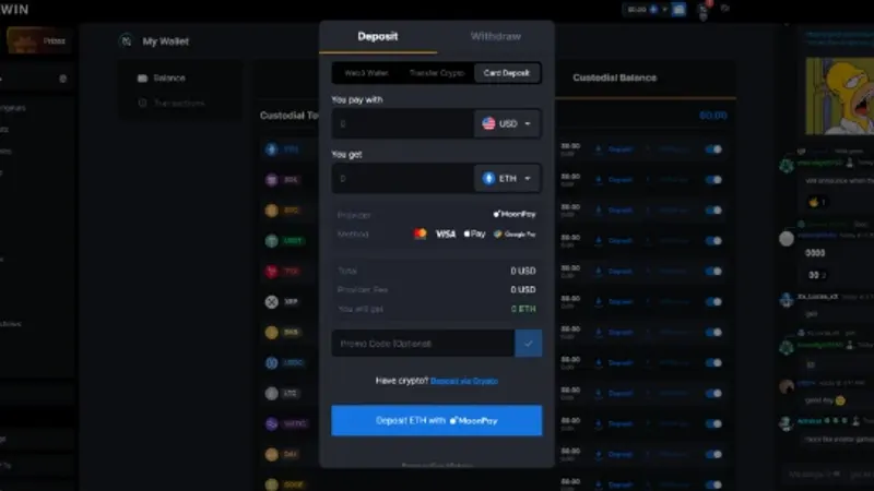
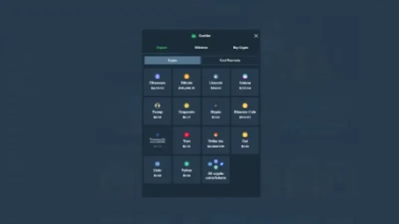
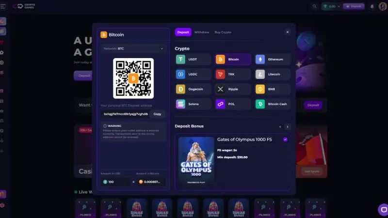
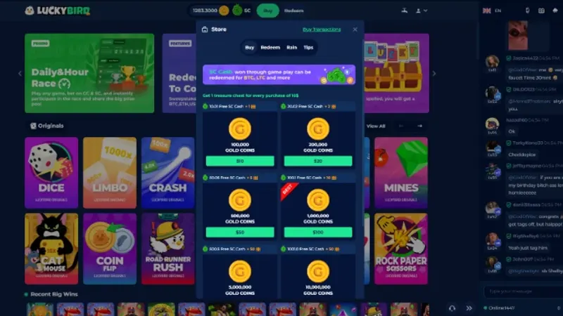
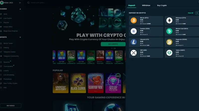
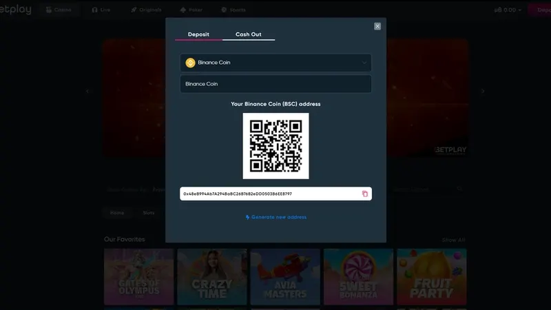
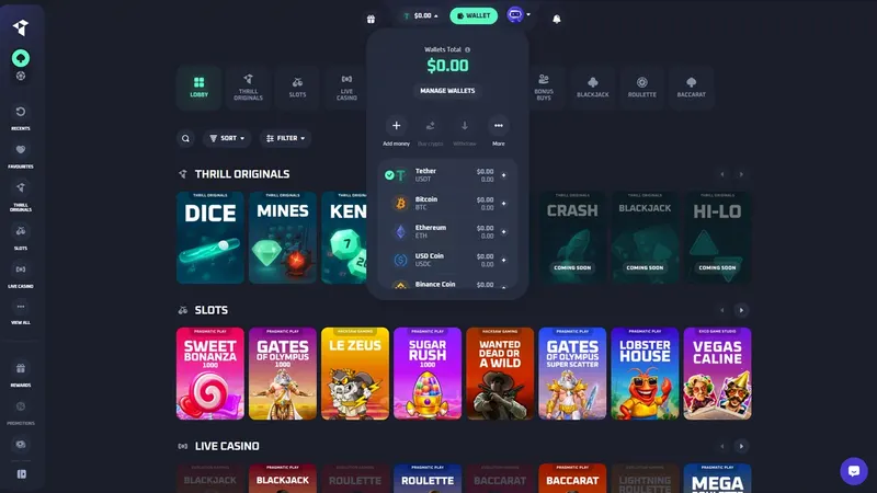
We reviewed 28 casinos: cashier structure, deposits and withdrawals, payment methods, saved cards, bonuses and promo codes, and how all of it behaved on mobile.
In our working sessions I kept the research tied to the decisions ahead of us: which patterns were worth following, which weren’t, and where to look next.
Access was the hardest part. Real Money casinos are gated by geography, regulation and account requirements, so reaching each comparable cashier meant finding an accessible product, creating an account and working around regional restrictions.
Key findings
A benchmark is only useful if it changes what you do. Three patterns shaped the direction more than any other.
A right-side panel, opened from the top bar, that leaves the lobby or the game in view.
Side by side, with one shared interaction model: learn one, and you know the other.
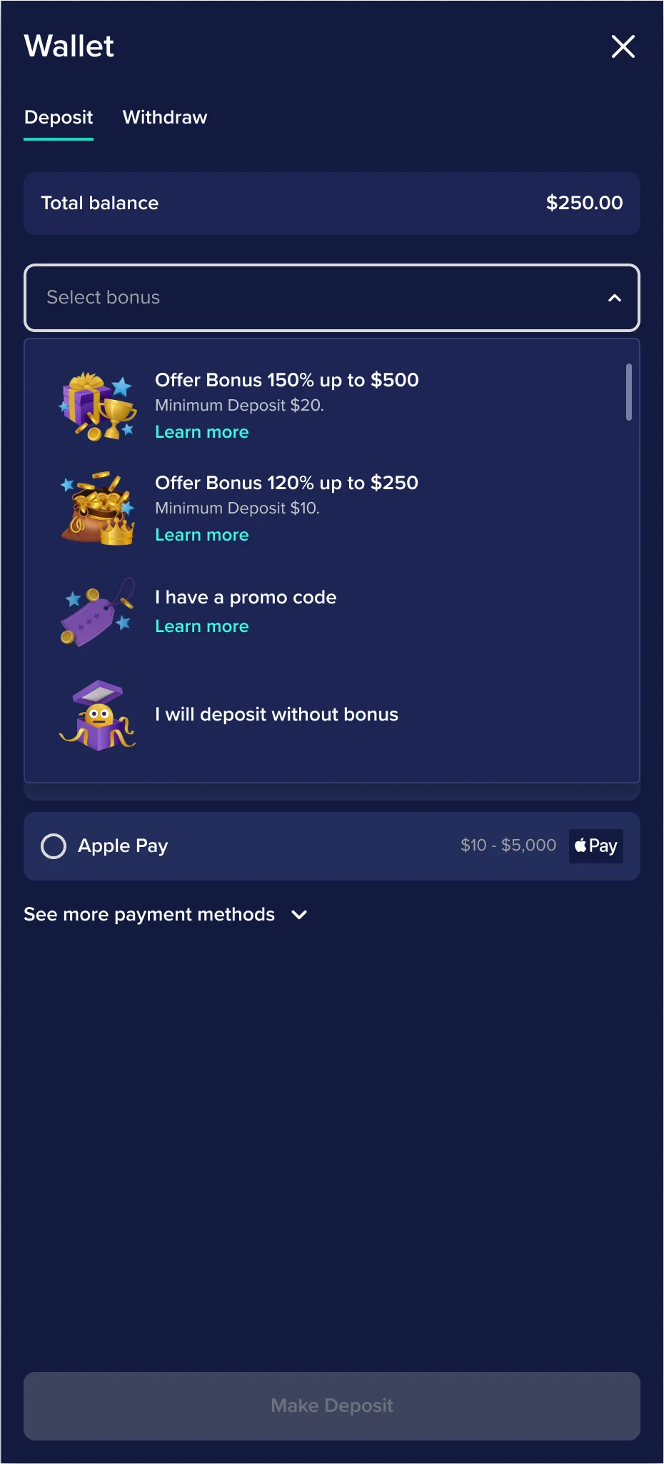
Inside the deposit, collapsed in a dropdown until the player wants them.
Direction
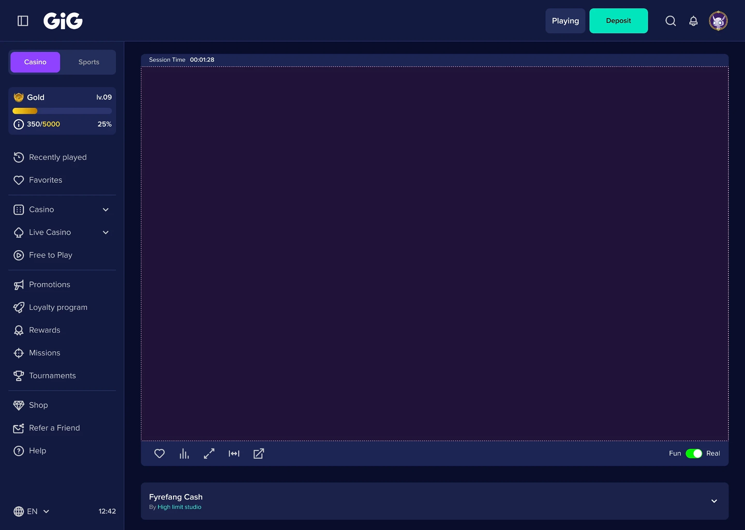
The benchmark helped us validate two key directions: keeping the cashier in context rather than moving users to a separate page, and using progressive disclosure to reveal payment and bonus details only when needed.
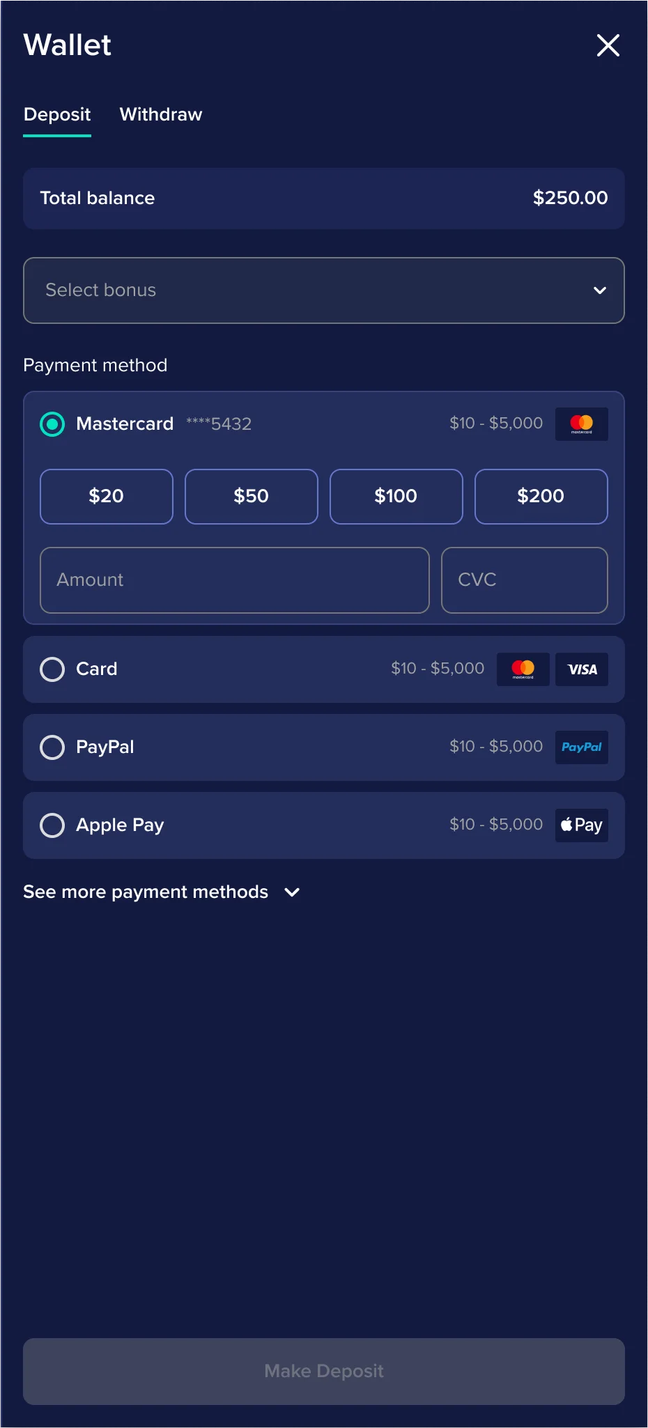
Based on those findings, we moved forward with a right-side panel and expandable patterns for payment methods and bonuses. This gave the experience a clearer structure while keeping the user connected to the main casino environment.
Design execution
With the research behind us, most decisions could rest on evidence, product requirements and technical feasibility rather than taste. My job was to find what was still missing.
Regular critiques with the designer: missing flows, inconsistencies and edge cases, with every step measured against the goals agreed at the start.
The designer presented each proposal to the Product Owner, with my support on open questions and disagreements. I presented the work to directors, including a Vice President.
We iterated to final approval, with the Tech Lead assessing feasibility in the weekly sessions so the designs could change before they reached development.
The final cashier
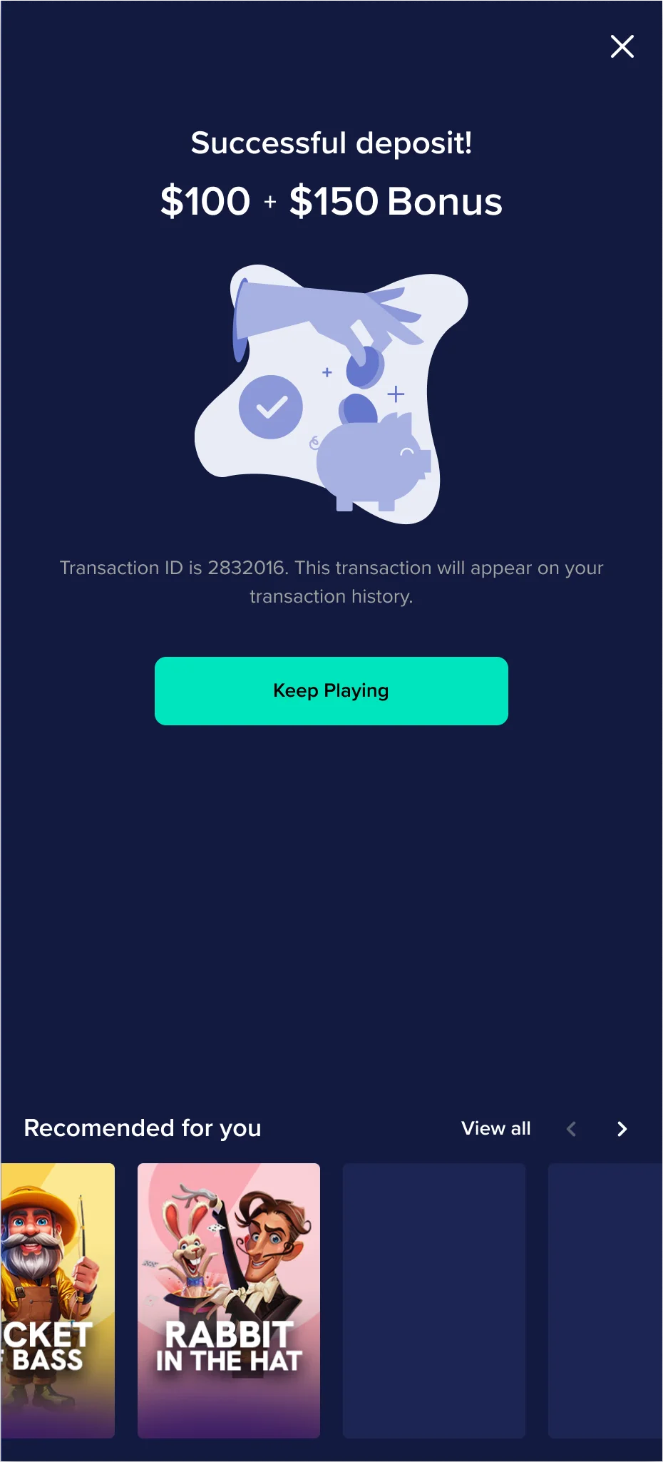
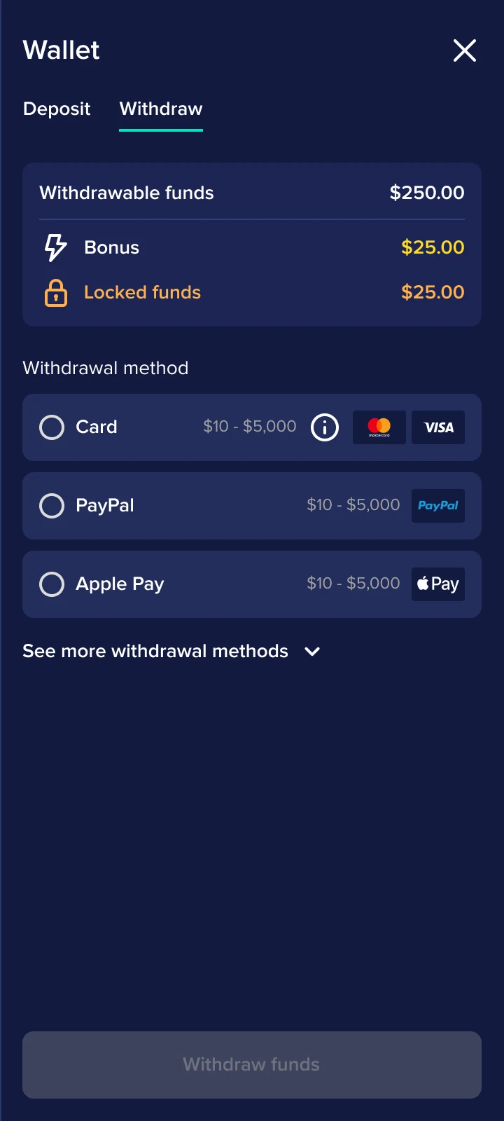
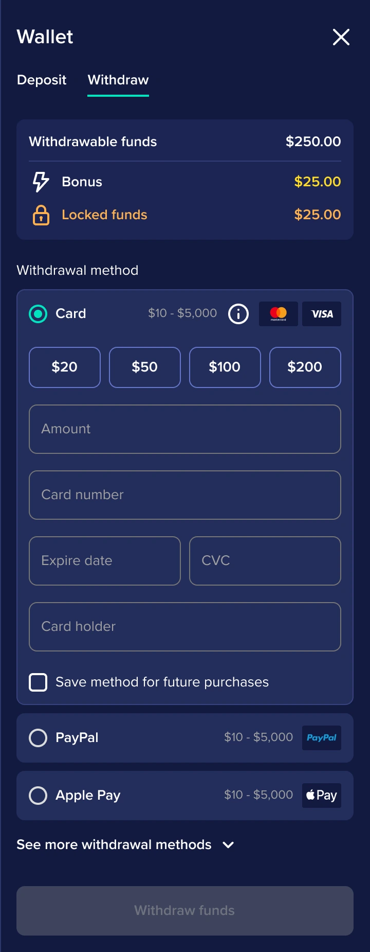
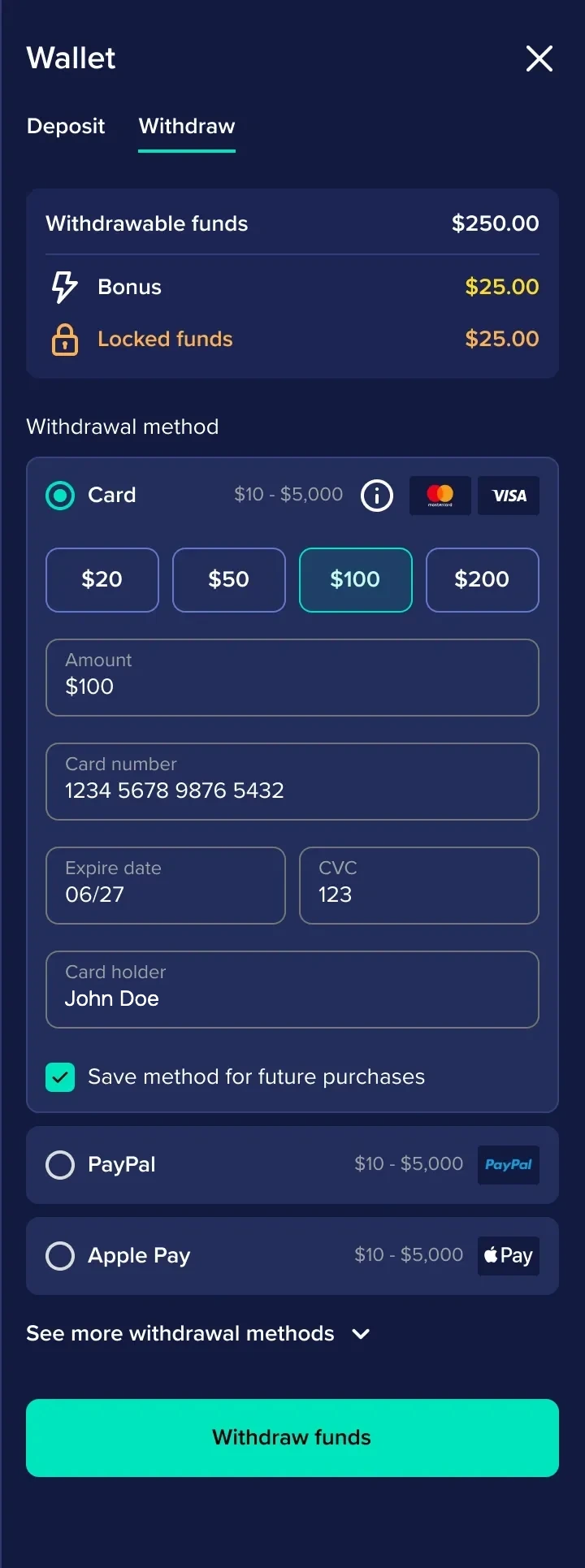
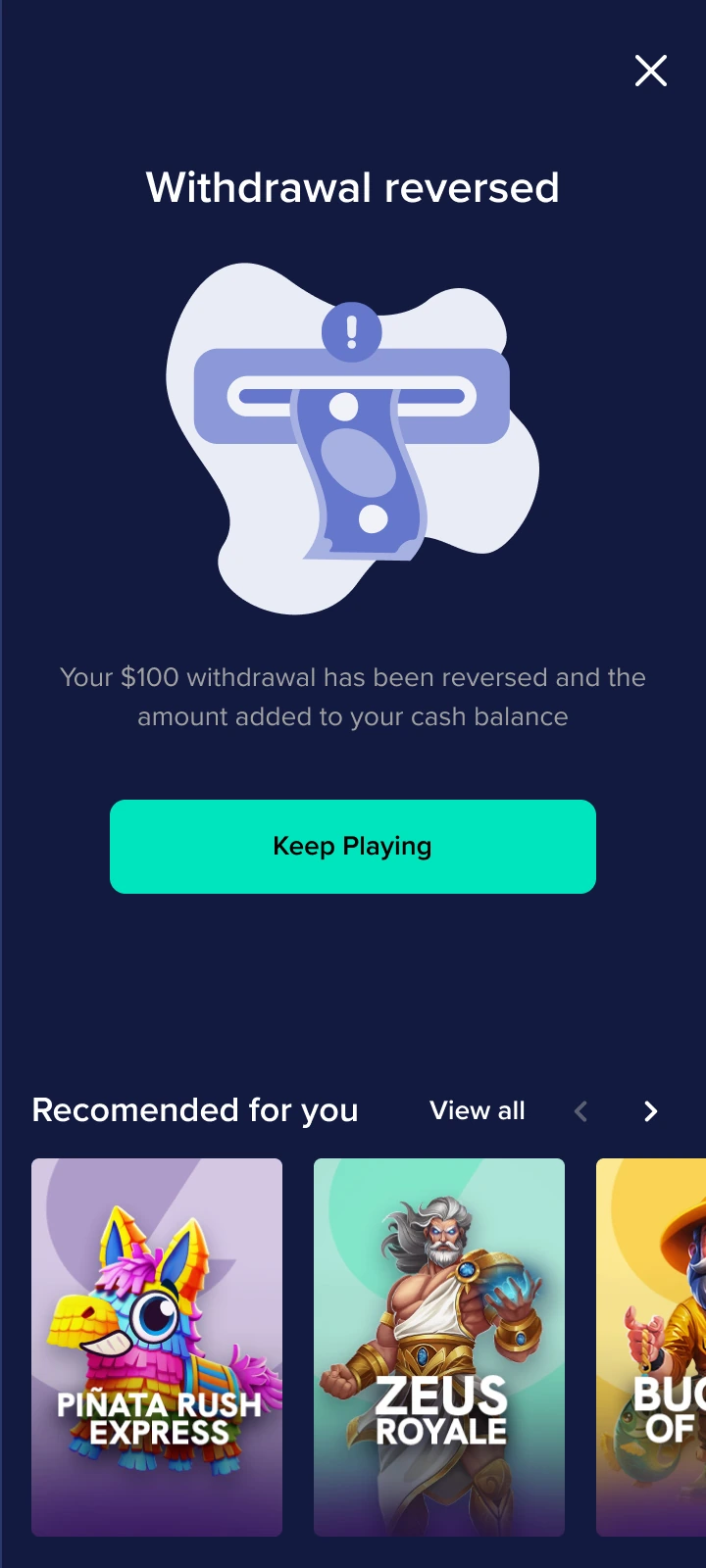
The resulting experience covers the main Real Money flows and states. Progressive disclosure does the heavy lifting: each step shows only what the player needs to act on.
Beyond real money
The same cashier adapts to other business models. At GiG it also supported Sweepstakes, with Gold Coins, Sweep Coins and redemption. A crypto version was explored as a concept to test how far the structure could stretch; it was never released. Use the Crypto switch to compare it with the real-money flow.
I’d be happy to walk you through both models in depth on a call.
Implementation
Development had started when we compared the build against the approved designs, and the gaps added up: spacing that was off, details that didn’t match the specification, visual inconsistencies.
There weren’t enough QA resources in development, so the design team took on much of the design QA. I reviewed the implementation with the team, raised the issues and kept the build moving back towards what had been approved.
Margins and gaps that drifted from the specification.
UI details that didn’t match what had been specified.
Components that looked different from one state or screen to the next.
Elements built differently from the approved design.
Outcome
A company restructuring removed the design department before launch, so there are no post-launch metrics to report.
What this project shows is how the work was led: a direction set early, tested against evidence and carried through to implementation.
Behind the work

I’d be happy to walk you through the research, the decisions behind the direction
and how we carried them into implementation.